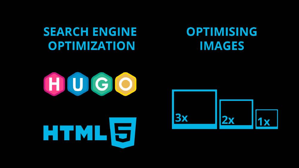
Optimizing images for the web is an important step in ensuring that your website loads quickly and effectively. There are several ways to optimize images for the web, including using the correct file format, compressing images, and reducing image size.
One of the most important ways to optimize images for the web is to use the correct file format. The most common image formats used on the web are JPEG, PNG, and GIF. JPEG is best for photographs and images with a lot of colors, while PNG is best for images with a transparent background or images with text or graphics. GIF is best for simple graphics and animations. Using the correct file format ensures that the image will be displayed correctly and will not slow down the page loading speed.
Another way to optimize images for the web is to compress them. Compression reduces the file size of an image without affecting its quality. There are many free tools available, such as TinyJPG and Compressor.io, which allow you to easily compress your images. Compressing images can significantly reduce the file size and improve page loading speed.
Reducing image size is another important aspect of optimizing images for the web. Large images can slow down page loading speed, so it is important to ensure that the images on your website are the appropriate size. You can reduce image size by cropping and resizing the images, and removing any unnecessary elements.
Image lazy loading is a technique used in web development to delay the loading of images until they are needed. The idea behind this technique is to only load images that are visible to the user, rather than loading all images on a webpage at once. This can significantly improve the page loading speed and user experience, especially on pages with many images.
When a webpage is loaded, the browser loads the HTML, CSS, and JavaScript first, and then the images. With image lazy loading, the images are not loaded until the user scrolls down the page and the images come into view. This means that the images that are not initially visible to the user do not slow down the page loading process.
There are different ways to implement image lazy loading, including using JavaScript libraries, such as Lazy Load or Lozad.js, or using the native “loading” attribute in HTML5.
SRCSET is an HTML attribute that allows you to provide multiple versions of an image and specify which image to display based on the device’s screen size or resolution. It is used to ensure that the most appropriate image is loaded for the device and screen size that is being used to view the webpage.
The SRCSET attribute is used in conjunction with the SRC attribute, which is used to specify the default image that should be loaded. The SRCSET attribute is used to specify multiple versions of the image, along with the width or resolution of each image. The browser will then use the image that is best suited for the device and screen size that is being used to view the webpage.
For example, you might have a small thumbnail image for mobile devices and a larger image for desktop devices. The SRCSET attribute would be used to specify the different versions of the image, and the browser would automatically choose the appropriate image to display.
The SRCSET attribute is a useful tool for improving the performance of web pages, particularly on mobile devices. It can be used to ensure that the most appropriate image is loaded, which can save bandwidth and improve page loading speed.
In summary, SRCSET is an HTML attribute that allows you to specify multiple versions of an image and specify which image to display based on the device’s screen size or resolution. It is a powerful tool for improving the performance of web pages, particularly on mobile devices, by ensuring that the most appropriate image is loaded.
Implementing SRCSET in Hugo
In partials for templates
First of all we can take a look at the Hugo resources for image optimisation. This is how I have implemented SRCSET in Hugo for the equipment single pages (e.g. gopro-hero-9-kit).
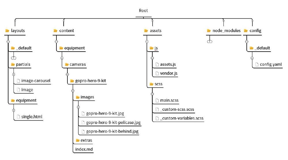
We will be referring to the following file and folder structure:
Within the equipment/single.html template we call the image-carousel.html partial:
          <div class="col-10 col-sm-8 col-lg-5 mx-auto ">
            {{ partial "image-carousel" . }}
          </div>
This is image-carousel.html:
{{ $path1 := .RelPermalink }}
<div
  id="carouselExampleControls"
  class="carousel slide "
  data-bs-ride="carousel"
>
  <div class="carousel-inner ">
    {{ range .Resources.ByType "image" }}
      <div class="carousel-item active">
        {{ partial "image" (dict "src" . "page" $ "alt" $.Title "format" "equipment") }}
      </div>
    {{ end }}
  </div>
  <button
    class="carousel-control-prev"
    type="button"
    data-bs-target="#carouselExampleControls"
    data-bs-slide="prev"
  >
    <span class="carousel-control-prev-icon" aria-hidden="true"></span>
    <span class="visually-hidden">Previous</span>
  </button>
  <button
    class="carousel-control-next"
    type="button"
    data-bs-target="#carouselExampleControls"
    data-bs-slide="next"
  >
    <span class="carousel-control-next-icon" aria-hidden="true"></span>
    <span class="visually-hidden">Next</span>
  </button>
</div>
With {{ range .Resources.ByType “image” }} we loop all the images with the gopro-hero-9-kit folder (or any other equipment folder). You can find more information on Resources.ByType here. Next, within the <div> we call the image.html partial with {{ partial "image" (dict "src" . "page" $ "alt" $.Title "format" "equipment") }}. With dict we pass an array of parameters to the partial. With . we pass the current context, which is the current image in the range iteration. With $ we pass the global context, which is the current page. $.Title is the page title and format is just a parameter to select the list of sizes for the image.
The following is the image.html partial, which takes care of the SRCSET:
{{ $src := .page.Resources.GetMatch .src }}
{{ $widths := site.Params.image.widths.default | default (slice 400 600 800 1200) }}
{{ if eq .format "equipment" }}
{{ $widths = site.Params.image.widths.productSingle | default (slice 336 465 535 700 1000) }}
{{ end }}
{{ $widths = sort $widths }}
{{ $srcset := slice }}
{{ $img := "" }}
{{ range $index, $width := $widths }}
{{ $resize := $src.Resize (printf "%vx" $width ) }}
{{ $srcset = $srcset | append (printf "%s %vw" ($resize.RelPermalink | safeURL ) $width) }}
{{ if eq (len $widths) (add $index 1) }}
{{ $img = $resize }}
{{ end }}
{{ end }}
{{ $srcset = delimit $srcset ", " }}
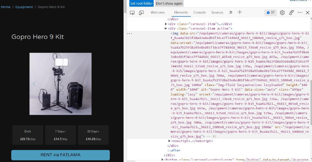
<img
data-src="{{ $img.RelPermalink }}"
data-srcset="{{ $srcset }}"
class="img-fluid lazyload"
height="{{ $img.Height }}"
width="{{ $img.Width }}"
alt="{{ .alt }}"
data-sizes="auto"
/>
<noscript>
<img
src="{{ $img.RelPermalink }}"
class="img-fluid"
height="{{ $img.Height }}"
width="{{ $img.Width }}"
alt="{{ .alt }}"
/>
</noscript>
In the first part we use {{ $src := .page.Resources.GetMatch .src }} to get the image url. A list of image widths is assigned to the variable $widths. These values are available in the config.yaml file:
params:
  image:
    widths:
      default: [400, 600, 800, 1200]
      equipment: [336, 456, 535, 700, 1000]
With {{ $resize := $src.Resize (printf "%vx" $width ) }} we are using a Hugo command to resize the image to the specified width and/or height. Hugo wants something in the format of {{ $image := $image.Resize "600x" }}. So we use %v in the printf function to insert $width. This is repeated for all the widths in the $width array. As we loop through the widths we build up the $srcset array of strings, by appending a new element at each loop. Here with $s we add the filename $resize.RelPermalink and with %v we add the $width. We add the safeURL pipe to avoid Hugo escaping the link.
Within the <img> tags we need to specify the URL of each image data-src="{{ $img.RelPermalink }}" and the srcset data-srcset="{{ $srcset }}". We want the image to be responsive so we use the class img-fluid, but we also specify lazyload to guarantee the lazy load behaviour. Hugo also automatically calculates the hight for us, which we can specify here height="{{ $img.Height }}".
For lazyload we need to install lazysizes:
We need to load lazysizes from assets/js/vendor.js:
import 'lazysizes';
import 'lazysizes/plugins/native-loading/ls.native-loading';

lazySizes.cfg.nativeLoading = {
  setLoadingAttribute: true,
  disableListeners: {
    scroll: true,
  },
};
The reason why we are adding data- before sizes, src, and srcset is because that’s how lazysizes wants it.
In the last part <noscript> is used in case JavaScript is disabled in the browser. For this we need to add a bit of code in assets/scss/main.scss:
.no-js img.lazyload {
  display: none;
}
img[data-sizes='auto'] {
  display: block;
  width: 100%;
}
This is how the code is rendered:
The best way to check if this is working is by resizing the browser size and inspecting the size of the rendered image.
Using shortcodes inside markdown files
For images we wish to include directly in the markdown file of a page, for example the current one, I’m using the /shortcodes/image2.html shortcode (between double brackets!):
< image2 src="images/folders-structure.jpg" alt="folders structure" format="equipment" colSize="12" >
Note that here I’m skipping some of the parameters. Note also that for some reason it won’t work unless I include the path images/ with the filename.
The code for image2.html is:
{{- $src :=.Get "src" -}}
{{- $alt :=.Get "alt" -}}
{{- $format :=.Get "format" -}}
{{- $colSize := .Get "colSize" }}
{{- $captionAlign := .Get "captionAlign" }}
{{- $learnMore := .Get "learnMore" }}

{{- $src := .Page.Resources.GetMatch $src -}}
{{- $widths := site.Params.image.widths.default | default (slice 400 600 800 1200) -}}

{{- if eq $format "equipment" -}}
  {{- $widths = site.Params.image.widths.productSingle | default (slice 336 465 535 700 1000) -}}
{{- end -}}

{{- $widths = sort $widths -}}
{{- $srcset := slice -}}
{{- $img := "" -}}

{{- range $index, $width := $widths -}}
  {{- $resize := $src.Resize (printf "%vx" $width ) -}}
  {{- $srcset = $srcset | append (printf "%s %vw" ($resize.RelPermalink | safeURL ) $width) -}}
  {{- if eq (len $widths) (add $index 1) -}}
    {{- $img = $resize -}}
  {{- end -}}
{{- end -}}
{{- $srcset = delimit $srcset ", " -}}

<div class="container">
  <div class="row">
    <div class="col"></div>
    <div class="col-{{ $colSize }} ">
      <img
        data-src="{{ $img.RelPermalink }}"
        data-srcset="{{ $srcset }}"
        class="img-fluid lazyload"
        height="{{ $img.Height }}"
        width="{{ $img.Width }}"
        alt="{{ $alt }}"
        data-sizes="auto"
      />
      {{- if .Get "figureNumber" -}}
        <figcaption class="figure-caption {{ $captionAlign }} py-1">
          <span><b>{{ .Get "figureNumber" -}}</b> | </span
          >{{- .Get "caption" -}}<span
            ><a
              href="{{ $learnMore }}"
              target="_blank"
              rel="noopener noreferrer"
              >Learn more about this project.</a
            ></span
          >
                </figcaption>
      {{- end -}}
      <noscript>
        <img
          src="{{ $img.RelPermalink }}"
          class="img-fluid"
          height="{{ $img.Height }}"
          width="{{ $img.Width }}"
          alt="{{ $alt }}"
        />
      </noscript>
    </div>
    <div class="col"></div>
  </div>
</div>

<a href=""></a>
Which is basically an extension of what we’ve seen before.